Monday, March 27, 2017

Processing Multi-Spectral Imagery

Introduction

This weeks lab includes working with imagery that contains five bands which are blue, green, red, red edge, and infrared.  The difference between working with a red edge sensor and a regular RGB is that it can collect light waves that are between the red and infrared sensor.  It also then creates separate images for each of the different bands instead of making one image containing RGB which then have to be separated if needed.

Methods

The first step is to open up Pix4D, which can be used to process the images taken by the platform.  This is done by choosing the Ag-Multispectral Processing Template (Figure 1), but when choosing this template in the processing options the orthomosaic option needs to be checked so it is made to later be used in ESRI's program.

Figure 1: When starting the new project select Ag Multispectral. Obtained from  Pix4D Support Website.

Next, after Pix4D is finished processing the images, open ArcGIS Pro or ArcMap and in the search bar type in composite band.  This allows the user to combine the bands to create a composite.  The bands need to be entered in the order: blue, green, red, red edge, and IR (Figure 2). Once this is finished a composite will be generated which will allow the user to start on the end goal of creating a impermeable vs permeable map for this specific lab.


Figure 2: This is the Composite Bands tool which allows the user to combine all five bands into a single raster image.  This needs to be in the correct order otherwise later processes will not work correctly. 

After, generating the composite image the next step is to run the segment mean shift tool (Figure 3) This smooths out the image to allow for easier classification in later steps.  For this the spectral detail was changed to 8 and 2 for the parameters.  This should take a few minutes, but depends on the size of the image.

Figure 3: This is the segment mean shift tool.  This allows the user to create a more general looking image to create classes from.  

Next, is to go into the toolbars and find the image classification bar.  Then combine the same classes of road, driveway, roof, shadow, field, grass, farm area (Figure 4).  Then once finish save the file to be used in the next tool.  The next tool is the train the train support vector machine classifier.  This allows the program to sort the pixels into different classes based on the image classification file.

Figure 4: This tool creates samples to use to train the classifier in the next step.  It is important to make separate classes to make the different layers. 


Once the tool from the previous step is finished the next step is to reclassify.  To do this use the reclassify tool and change the classes that are impermeable to 0 and the classes that are permeable to 1.  This allows the user to create a simple map that shows what area are permeable.
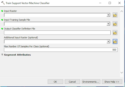
Figure 5: This tool allows the raster to be classified into the categories created in Figure 4.  This will create a new image that can be then reclassified into a final map. 
Results


Figure 6: An RGB map of the Study Area.
Figure 7: A false Color IR of the study area.
Figure 8: A Red Edge image of the study area.

Figure 9: NDVI of the study area showing crop health.
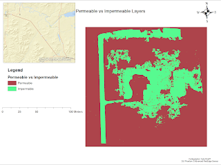
Figure 10: Permeable vs Impermeable layers.  Not well created from the training sample vector machine.

Discussion

This lab seemed to be one of the more nit-picky labs in terms of file management and making sure everything was saved in the correct place to be used. It also was helpful to look back at the previous lab and even bring in the same tools. The map created for the impermeable vs permeable area was not easily created and does not even come close to perfectly showing what it should be.  The shadow of the house was included in the house instead of the vegetation, and there are random areas in the upper right that are classified as house instead of vegetation.  There is also not a neat line that goes along the road and instead gives a more of a fuzzy look.  It also did not classify the house as even being impermeable, and rather put around the house as the impermeable area (Figure 10). This would not indicate the best way for determine the permeable vs impermeable layers.  Using the classifying tool does not give the highest accuracy and should be used with caution. In Figure 9 there is a NDVI showing the plant health.  This is an interesting figure because it shows around the house that there is very healthy green grass that can be seen in Figure 6.  It also shows farther away from the house where the land is less likely to be cared for in the same fashion as the grass near the house, shows that the quality is diminished for plant health.  With this type of sensor there area many different types of application.  It can look at agriculture health to determine what areas need to be watered, and by using the rededge sensor the user can select which bands to look like without having to extract them because they are already extracted.

Conclusion

UAS can be a tool by using a rededge sensor for agriculture use.  If someone was taught how to use a UAS the user could potentially every day use the UAS to figure out which fields need to be watered compared to the ones that do not.  This can save water and time spent on watering fields that are not needing it as much.  With the red edge senor having five separated bands it creates more uses that can be looked at with different types of images and not just RGB.  It can look at RedEdge, IR, or False color IR. For rededge the most applied use will be within agriculture.


Sunday, March 12, 2017

Pix4D Processing with Ground Control Points

Introduction

This lab was meant to bring understanding to why there is a need to have ground control points when taking aerial photos with a platform.  The ground control points (GCP) add an extra level of accuracy to the final project than without them.  For this lab the same data was used as the last Pix4D lab except GCP were added into the equation to create a higher quality dataset.

Methods

The first step is to open up a new project in Pix4D and create a folder to save everything for the project in with a decent naming scheme to help organize the information.  Next, add the images like the previous Pix4D lab.  Make sure the camera is on linear rolling shutter before starting the initial processing. After the initial processing is over, go to Project ---> GCP/MTP Manager.  This open up a screen that will allow the user to upload the GCP file (Figure 1). For this GCP file the order needd to be switched to Y, X, Z due to where the Y value was placed in the .txt file.  This should be double checked before going on to save time later after secondary processing has taken place.
Figure 1: Showing what the imputed GCP will look like. 
Next, there is a problem that starts to happen.  The GCP are not tied to the ground well making the pictures and GCP appear that they are floating.  This is not the easiest problem to fix, but it can be fixed using the basic editor or the rayCloud Editor found at the bottom of the GCP manage.  

Now, to tie down the photos, the user needs to go through 3-4 of the points to correct the ground control points (Figure 2).  For the rayCloud editor, go through each GCP and for the first few images fix the location of the point.  Once that is completed selected automatic marking and then apply.  Continue this for each GCP.  Finally, once accomplished rematch and optimize the dataset (Figure 3).  
Figure 2: Ground control points being fixed by the ray cloud editor. 

Figure 3: Showing where the rematch and optimize tool is. 
Next. after the rematch and optimize the 2nd and 3rd steps need to be done on the processing.  This is going to take little while, therefore it is good to plan some other work to be done at this time due to the time needed to process.  Once it is done it will have connected the GCPs to the ground along with the images (Figure 4).  

Figure 4:  This image shows the ground control points and images connected to the actual level of the ground.  
Now, there are two ways to deal with having two sets of data for this project.  First of all, with only two sets it can be done with both of them at the same time for processing, but if there are more data sets than 3 or 4 then a merge needs to be done to allow faster processing times or just as the project is completed over multiple days can still be added to the first project.  This is done on the first screen by selecting the merge project instead of new project.  Finally, once the Orthomosaic is finished it can be opened in ArcMap where it can be made into a cartography pleasing map (Figure 5).  


Results

After all the processing is finished the newly created DSM can be brought into ArcMap where a finished project can be created for the viewer to see the data.  This map has turned out slightly more accurate than the map created in the first Pix4D lab which is a result of using the ground control points.  There is more detail made along most of the sand piles in the located in the right center of the map.  The area with the most distortion also has been limited to the area instead of having long dragging areas its more of just lobes on the bottom.  This only would have been fixed competently if there would have been more images taken in this area.  The elevation is also at its lowest point near the water which makes logical sense.  


Figure 5: A Map created from Pix4D using Litchfield Flight 1 and 2 Data. 
Conclusion

Ground control points are a great tool to have more accuracy on the finished project than without having any GCPs at all.  There are also needed when merging two different projects from the same location together to generate a more cohesive map.  Also, having fieldnotes with location of the GCPs drawn out and also having a list on the computer of each of their location would be a great idea for a back up plan if for some reason all of the data was lost or corrupted.  

Sunday, March 5, 2017

ArcGIS Pro Demo

Intro

Today will be a dive into ArcGIS Pro demo which can be located at here.  This demo is to teach how to create a permeable/impermeable layer map from an aerial photograph.  This is done by using a few different tools that will be mentioned in the methods section.  ArcGIS pro is the new updated version of Arcmap and ArcScene.  In a few years ESRI will be moving to ArcPro.  The main difference is having more of a ribbon style banner instead of the tool bars everywhere.

Methods

The first step is to open up an already processed aerial image into Arcgis Pro.  This one used for this demo had a resolution of 6 inches and contains 3 bands.  Under the projects tab and then under task there is a calculate surface imperiousness tool.  This is used in conjunction with the bands to determine where there is surface imperiousness (Figure 1). Then the next tool used is called "group similar pixels into segments." This allows the image to be simplified to more accurately classify broad land-use types (Figure 2).

Figure 1: On the right, where it is highlight is under the tasks, and on the left is what the tasks open up into.  This allows the run of the surface imperiousness tool.  
Figure 2:  This is the more simplified image which shows the smooth edges well.  
The Second lesson has the user open Arcmap to create a training sample, which cannot be made in ArcGIS Pro currently.  therefore, a shapefile will be made to open in ArcGIS Pro.  First, open the Neigborhood and segmented images and turn on the image classification toolbar.  To use the image classification tool bar spatial analysis needs to be turned on in the extension window.  Next, on the classification tool bar click the drop down on the draw polygon tool to select the draw rectangle tool. Next, start to draw rectangles on the roofs of the houses found in the cul-du-sac.  Then open up the training sample manager (Figure 3). Next, highlight all of the training ID's and merge them together into one class name.  The next step is to repeat the last step except for roads, driveways, bare earth, grass, water, and shadows (Figure 4).   Finally, to finish this step open it back up into ArcGIS Pro.
Figure 3: Image showing the rectangles on the roofs, and where the class can be found in the training sample manager. 

Figure 4:  This is an image showing the Training sample manager should end up like.


Now, back in ArcGIS Pro open up the train the classifier task.  This opens up the parameters window.  Input the raster and training sample file, and then make sure to save it in the correct place with the extension .ecd (Figure 5).


Figure 5: Train the classifier parameters window.  

The next step is to select the classify the imagery from the tasks tool bar.  Input the correct information into the right spots, and run the tool.  It should create an image that has the colors of the classes to look like Figure 6.
Figure 6: Reclassified image of the original using the classes created from the pixel color.  
Now,  it is now on the reclassify tool which allows the user to change the value of the fields.  For this demo change the gray roofs, driveways, and roads to 0, and change the rest of the fields to 1.  This will create an image like Figure 7 after it has ran the reclassify again.

Figure 7: the final reclassify that distinguishes between roofs, driveways, and roads to bare ground/penetrable ground. 
Finally the last lesson is to calculate impervious surface area.  To start, click on the create accuracy assessment points in the task window.  Then enter the information as described in the tutorial and let it run.  It will create an image that looks like Figure 8 with all of the accuracy points now added into it.
Figure 8:  Accuracy points added to the map.  
The next step is to open the accuracy points in the contents window to allow the modification of the GrdnTruth column.  The 1 means permeable and the 0 means impermeable.  This is required to go through each point to determine this and change as needed (Figure 9).  Then return to the task bar and hit next and run to finish the accuracy assessment points.

Figure 9:  Showing the editing of the GrndTruth. 
The next step is to compute a confusion matrix.  This is done by selecting the compute a confusion matrix under the task window.  Then enter the accuracy points in the input and create a correct output. This generates the ability to give an estimate on how accurate the data is.  In Figure 10, the image is showing an accuracy of 92% under the Kappa heading.
Figure 10: Showing the Confusion Matrix Results. 
Next,  is to fill out the tabulate area parameters with the information found in Figure 11.
Figure 11: Tabulate the area parameters. 
Now, after creating the new table a table join tool opens up next that can filled out exactly like Figure 12.  This joins together the two tables.
Figure 12: Table join.  
Finally the last step up sets is to symbolize the parcels.  The first step is to select the clean up the table and symbolize the data from the tasks window.  This is done by deleting a field and modifying the name of a few of the fields to better suit their needs (Figure 13).
Figure 13: Attribute table being edited. 
Finally after modifying the attribute table go to the symbology window to change it to graduated colors maps with 7 breaks (Figure 14).
Figure 14: Graduated color map showing the impermeability of the land classification with 7 different classes. 
There are a few different patters that can be seen in the image above.  First off, There seems to b a lot more of the yellow (permeable) on the outside of the neighborhood compared to the middle which is due to the houses surrounding the pond.  Therefore, most of the water filling the pond may be coming from the outside of the neighborhood instead of the neighborhood where it most likely just flows off. Also, the pond itself is not the darkest red (impermeable) due to its ability to take water into the ground.  

This data set can be used with UAS by doing a comparison to data collected by UAS using the same type of imagery, and looking for similar spectral patterns.  A UAS platform may even be able to get a more accurate representation of the area by generating a larger amount of pixels.  This type of map can be used as a first look at the data, but a UAS should be able to get more detail if needed.  Also, a UAS would be able to make this faster if using the same method.

Pix4D Processing

Introduction:

Pix4D is a useful software that can be utilized to process many images taken by UAS platforms.  With this program it can put together images at a relatively quick pace (depending on size of files), and create professional looking images.  With the ability to process this data it can then be brought into Esri's ArcMap or Arcmap pro to create maps that can be displayed with the relative information. The program is relatively easy to understand as well as having everything needed placed out well.  Also, many questions can be answered through the help directory on the program as well as other forums found on the internet.

Some questions that should be known before using the program to generate good results:

o Look at Step 1 (before starting a project). What is the overlap needed for Pix4D to process imagery?
75% frontal overlap with 60% side overlap

o What if the user is flying over sand/snow, or uniform fields?'
85% frontal and 70% side overlap is needed for these areas.

o What is Rapid Check?
Rapid check is more used in the field to make sure everything is going correct for the map/coverage.

o Can Pix4D process multiple flights? What does the pilot need to maintain if so?
Yes, it can process multiple flights, and the pilot needs to maintain altitude.

o Can Pix4D process oblique images? What type of data do you need if so?
It can process oblique images it just needs the angle it was taken at.

o Are GCPs necessary for Pix4D? When are they highly recommended?
They are not necessary for Pix4D, but they are highly recommended when trying to reduce the noise and make the image more accurate.

o What is the quality report?
 The quality report is what is created after any of the processing steps to give feed back of how each processes went.  It alters to any fixes that may need to be done, and it gives the user a quick check on how the data is starting to look.  It gives statistics and anything that may be needed for how good the data set is.

Methods:

There were two flight logs given (unprocessed) to be used with Pix4D to create an orthomosaic of all of the images given.  The first step is to create a file/place to save all of the data sets to.  For this, the best way was to create a folder names 2017monthday with a flight 1 and flight 2 folder inside that.  This will help to keep the data separate and easily accessed.  The next was to run a summary report on the data before doing the full data to make sure all of the data is correct and there are no errors.  This can catch thing before having to wait long periods of time just to start over again.  Also, when inputting the data for the DJI Phantom 3 advance the camera needed to be changed to rolling shutter.

The next step was to run the initial processed data which gives a quality report (figure 1 & 2).

Figure 1: Summary of the first flight.   

Flight 2: summary of the second flight initial processing. 

Also with the report summary a coverage map is created.  The areas with the most coverage will be near the middle because there will be more pictures to overlap with compared to the outside where it is on the edge with less photos to be matched up with (Figure 3&4).
Figure 3: Coverage map showing the most coverage being in the middle.

Figure 4: Coverage is highest in the middle and lowest on the outside.  

This is import to view because it will show if there is any missing data within the area of interest along with how accurate the data will be.  The more coverage the higher the amount of accuracy there will be.

Now, the next step is going be to actually run the full process. This may take some time depending on the data size. This will then generate an otheromosaic for each set of data.  These can then be added into Arcmap to generate a map of the region. Figure 5 and 6 show the data that was processed in Pix4D and brought into Arcmap to be made into elevation maps.

Figure 5:  Flight 1 data after being processed in Pix4D
Figure 6:  Flight 2 data after being processed in Pix4D

This is a flyby created in Pix4D.

Results

The Flight 1 data in Figure 5 (above) has a few different patterns where there are almost roads that go between the piles of sand along with there being some type of distortion in the southern part that was mostly caused from not having enough overlap in that region or some other problem that may have occurred during the actual flight. In the second flight image (Figure 6) There is a lot of distortion on the south eastern side of the image.  This is also mostly caused by not having enough images on the edge, but that is not the area that is going to be looked at for trying to solve for volumetrics, length or other processes. With both images there seems to be more detail in the center areas of the image compared to the outside.

Conclusion

Pix4D is a powerful tool for anyone looking to process aerial photographs, but if you use really bad data with not enough coverage the program will still be able to create an image, but it will not be up to standards for accuracy. It also is also a great program for figuring out the any type of 3D processes within the program.  This program can be used as a great tool, but the user needs to understand the what the process is doing, and how the program calculates it to get the highest amount of accuracy.