Saturday, April 29, 2017

How to make Ground Control Points


This week as a class we made ground control points to use in our next few weeks of flying.  These are especially helpful for making UAS imagery more accurate when processing the data.  Therefore we met up at Dr.Hupy's house to create some out of a special type of wood.  

The first step was to use the table saw to split the wood in half the long way; then cut those long pieces into smaller squares like shown in Figure 1. 
Figure 1: Using the table saw to create square ground control points.
After the wood is cut we used a guard to spray paint a neon-pink triangle onto the wood.  Once this dries we flipped the guard around and did the same thing.  There was also a number added to keep track of each GCP.


Figure 2: The guard is being used on the left, and on the right is the outcome after the guard has been lifted.

Figure 3: This is the final outcome with the triangles touching and with the numbers stay painted on each.

Friday, April 21, 2017

UAS Mission Planning Fundamentals

Introduction

Planning out a mission is a delicate processes that needs to be planned for before heading out into the field. Mission planning is a plan created with software that creates a path for the UAS to fly.  It is best practice to make a few different plans before heading to the site; where it can be fine tuned to anything that was missed.  This is a great place to utilize geospatial data if there is any available.  This could include DEM, DSM, or topographic maps.  It is also good practice to check on the weather before heading out into the field and once at the location to make sure the conditions are within reason.  Another question that needs to be asked is about cell service.  This is important because data can be used with cellular service or it can be downloaded beforehand.  It is also beneficial to ask about any EMI issues that could be present that the landowners may know about like power lines, underground metal or cables, or power stations.  One last thing before heading out into the field, everyone needs to agree on one type of units, whether metric or American (Imperial), it does not matter as long as everyone understands.

Methods

Before Flight Checks

 First off, before leaving make a checklist that has everything that needs to be brought with.  This includes tablets, laptops, drone, weather devices, etc.  Also make sure that all devices are charged to full capacity to ensure everything last the maximum amount of time once into the field.  The next subject to think about is to know the vegetation and terrain of the area of interest.  Is the AOI have high relief, or does the AOI have large vegetation that can affect what altitude can be flown at. There may also be the possibility of obstacles like cellphone towers or large silos that need to be known to create a doable mission plan.  It is also important to make and use a checklist to ensure all supplies are brought with.  along with checking all of the equipment in the field before take off to prevent any problems and keep everyone safe if something were to go wrong.

Next, fine tune the mission plan to anything that may of come up/go over the mission plan with everyone in the crew and get a final check on the weather, and to look for any power lines or anything that may be have been missed. It's also important that everyone in the crew knows how to get to a hospital if anything wrong happens; this is a very important safety issue because someone in the confusion of the moment may go the wrong way, therefore making this known is imperative.

Now, that the drone is set up and final checks have taken place it's time to get an elevation of the launch site. and confirm the mission being used.

Finally, take off with the mission software and give 100% attention to make sure all problems can be dealt with as it happens.


Software Demonstration

For this demonstration Bramor's C-Astral Pilot C3P Software is used.  It has an amazing layout that can easily be used on tablet in the field making this easier than bringing a whole laptop with.  The icons to change mission plans, insert wind, or to draw new missions are easily used and quick.  This makes changing the mission plan fast and easy to do on the fly.

For this simulation, I created three different types of missions along the Bramor test field and one location in North America.  The three different types are waypoints, corridors, and an area coverage grid.  The way points are pretty much straight lines that the drone will follow from the first to last (Figure 2 and 3). The corridor is creating an area around waypoints to get more coverage (Figure 4 and 5).  The last is having the ability to create any shape which will then create a grid mission for the drone to fly over (Figure 6,7,8,9,10). One of the cool features that this program comes with is showing that when flying to low the map will show a red area where the drone could fly into a mountain or something.  This make it easy to change the height or direction of flight.  Another cool feature is having the ability to export straight to Google Earth or ArcGIS Earth which can show the flight path in a 3D view.  This is great for showing anyone that needs to see or approve of the project because it creates a cool graphic of the flight path.


When first planning the mission there are a few factors that need to be account for.  For example the wind strength and directions.  For example if it is 5m/s at 015 degrees.  The best plan would be to take off into the wind to give the the drone the best advantage it can have. on the mission planning software there is a home-point, takeoff, rally, parachute, and land point on the map.  These are important when starting a new mission.  Therefore, with the wind above the best way to have the drone take off is having it positioned Southwest of the home location.  Also, a nearby rally point needs to be created.  The rallypoint is where the drone will fly to after to start its descent and or if manually operated due to an error will fly to this spot to wait for its next command. The next point is the landing spot.  For this position it is recommended to fly with the wind therefore having the landing in the northeast is recommended. There is a parachute icon connected to the landing spot.  With this program the parachute is automatically deployed taking into account the wind getting it to land in the correct spot.  This spots can be seen in Figure 2.
Figure 1: The mission settings. 
Figure 2: Way Point for flight path and showing the take off, landing, rally, home, and parachute icons.
Figure 3: Way Points 3D in ArcGIS Earth
Figure 4: Corridor Flight path 
Figure 5: Corridor flight path in 3D
Figure 6: Grid creation for flight path. 
Figure 7: Top view of flight path from figure 6
Figure 8: 3D view of Grid created flight path
Figure 9: Flight path created in North America. (My Neighborhood).

Figure 10: ArcGIS Earth view of flight path. 


My perspective

I thought this was an easy-to-use program that can be changed on the fly and has a lot of integrated variable that help make the process faster.  I liked that it was easily exported into ArcGIS Earth to show people the flight path in 3D.  I also liked that there were three different ways to create and manipulate the flight path.  It also makes for a great program having the ability to show where a drone will hit if it is not flown high enough or given enough time to gain elevation. I did not like that if i wanted to watch the whole mission go through the simulation I had to wait the full duration, but I feel that will be an easy fix in future updates.  I also thought this program looked easy to use on a tablet as it has large icons, easy to draw the mission plans and everything was just laid out and organized well. This makes it easier for the user to make the changes needed faster.  I did not enjoy having everything flashing at me when i opened up the program and would rather have a notification icon or something else to make easier to comprehend, although this is a very minor complaint.  This program really brings everything that is needed for mission planning software and is a solid program as I did not find any glitches when using it nor did I find any glitches when opening it in the 3D view.


Monday, April 17, 2017

Obliques and Merge for 3D model Construction

Introduction

This weeks lab is to work with oblique imagery.  This has been different than the past 11 weeks because the previous were all on nadir. On nadir means that the camera is facing directly straight down at the ground.  Whereas, oblique imagery is at an angle compared to the ground surface (Figure 1).  Oblique images are used in the geospatial marketplace to determine the height of different structures.  It can also be used to get a larger photo compared to the size of a nadir image.  It also gives the user the ability to measure the top of objects and the sides as well.  Taking oblique imagery is also used to create 3D models because to process the image it needs to have many different angles of the object.


Figure 1: A is on Nadir and B is off nadir or oblique. 


The study areas that are used are a bulldozer at the Litchfield mine, a Toyota Tundra in a parking lot, and finally a small building next to a track and field course both located at South Middle School.  The bulldozer images basically had sand surrounding the vehicle that needs to be annotated out.  The Toyota Tundra had grass and the sky that needed to be annotated, while the building had the sky, grass and the track that needs to be annotated to create a model.  Each of these sets of data seem to be taken during mid-day based on the shadows, except for the small building which may have been done later in the day due to the larger appearance of shadows.

Methods

To start this lab create a new project in Pix4D and set up a default folder to save all of the work in.  This will need to be done three different times for the bulldozer, the truck, and the building.  Once the folder is created use the "add director" tool to add all the images for the current project.  Click next, and change the camera to linear shutter. click next a final time and make sure to select the 3D Model template, and then hit finish to open up the main screen (Figure 2). at this point the location and images show up on the map. The pattern shows a circle around the object which looks like this because the goal is to make a model, and not like the previous labs where the goal was to create a DSM or orthomosaic which is why the pattern is a circle.  From here go to processing options and go to advance on the ray cloud to make sure the annotation is checked.  Close that window and un-check 2 and 3 from the processing bar at the bottom and start the initial processing.
Figure 2: 3D - Model Template
Now, after the initial processing is done the thrilling annotation part can begin.  To accomplish this next time on the left side of the screen, click camera -> calibrated cameras -> and click the first image.  now on the right side of the screen the picture selected will appear in the selection window like in Figure 3.  Now in Figure 3 where the mouse is hovering, the "Image Annotation" needs to be selected.  This will allow the user the ability to start highlighting the areas that are desired to be annotated.  This will create a purple like color on the image that will be the mask.  Once the image is fully covered in the areas needed it will look like the image in Figure 3.  Next, hit apply and move on to the next image and repeat this processes for as many images as needed.  After about 4 images go to Process -> Reoptimize to check the progress. The quality increases with more annotations due to the removal of unwanted pixels in the model, and it also increases with the use of different images at different angles.

Figure 3: Showing the annotation window and how it should look after annotating an image.


Next, un-select the processing step 1 and check the 2 processing option.  Start the processing.  once this is finished the annotation will be updated in the ray cloud and a fly-by can be created, which is most logical way to show off the newly created model.  These videos can be seen below.  For the other two sets of data the workflow will be the same to create the different sets.

Results

The first video shows the bulldozer that was not annotated.

This is the video that shows the bulldozer after the annotation was done.


Next, this is the Shed by South Middle School.


Finally, the annotated truck.


Discussion

Oblique imagery makes calculating heights and sizes easier with the ability to know the different angles and the height being flown at.  It also helps to create 3D models using the Pix4D software. Using Pix4D to annotate the images is a tedious task due to the way it selects pixels that cannot be easily predicted or quickly highlighted. There is not much of a difference between the first two images.  There seems to be more taken out of the second video, but it honestly does not make that large of a difference.  The process seems to need to do most of the images to get the best product out of this process.  The other annotated videos seem to be the same way.  It took out some of the background, but not nearly enough to make it noticeable.  For the models made above the truck seemed to turn out the best.  This most likely due to the fact that it had an easier boundary for the truck vs the ground/other objects.  To get the best results for this type of project the annotation should be done at many different angles.


Thursday, April 6, 2017

Volumetrics

Introduction

This weeks lab is to use an application for UAS that determines the volume within a stockpile.  UAS is a great tool for this because the images taken with the drone can be processed in Pix4D and also processed in ArcMap to determine the accuracy.  Using a UAS to determine the stock pile size is a way to reduce spending and increase the amount of times this can be done because an UAS could be sent into the air everyday to collect this data if it was needed.  For this lab there will be three different stock piles calculated using a few different methods.

o Raster Clip - Allows the user to clip the desired shape out of the entire raster.
Figure 1: Showing how a raster clip works. 

o Raster to Tin - This tools allows the user to convert a raster to a TIN data set.  This does not create a better surface based on quality.

Figure 2: Raster to TIN.


o Add Surface Information  -  This tool adds attribute features with spatial information that was found from the surface.


o Surface Volume - This tool calculates the surface volume of a region between a surface and the reference plane (possibly DEM vs TIN dataset).

o Polygon Volume -  calculates the surface volume between polygon and TIN surface.

o Cut Fill -  Calculates the volume changes between two surfaces.  This is determined by a sequential value that is given to each unique edge-connected area of cut, fill, or no change.  This is the toolbox operation that requires temporal data and not just one dataset.
Figure 3: Demonstrating how the cut fill tool works.  Notice that the change appears in the middle 3 blocks giving it the number 3 due to being cut, whereas the 30 to 35 was given a 2 because it was filled.  


The tools that will be used in this lab have not yet been used for this class therefore a detailed sections of them will be defined:


Map 1: Image showing the piles and what number is each for discussion below. 


Methods

Pix4D

The first step is to transfer the data from the previous lab into a new folder to start working on it.  This will be the Litchfield Mine data with both flight 1 and flight 2 data merged together as done in the previous labs.  Next, is to select the volumes on the left side of Pix4D and then the add volume symbol in the objects menu that pops up.  Then select three different stocks piles and calculate the volumetrics for these piles the piles selected can be seen in Figure #.

Figure 4:  Showing the volumes and stockpiles chosen for the calculations. Bottom = Volume 1 Right = Volume 2
Middle = Volume 3.
The Bottom Pile had an estimated volume of 746.25 Sq. m., The right side of the image pile had a volume of 616.27 sq. m., and the middle pile had a volume of 520.64 Sq. m. The Pix4D method is the simplest of the methods to calculate the volume with just creating the perimeter around the piles and calculating it (Figure 4).

Raster (ArcMap)

The first step for calculating volumes in ArcMap is to open the mosaic created from Pix4D and then create a geodatabase and 1 feature class for each pile.  When creating a feature class make sure it is a polygon feature and the correct coordinate system is used.  For this lab WGS 1984 Zone 15N was used.

Now, digitize the three piles which can be used with the extract by mask tool.  Then add in the DSM image.   Next is to used the Extract by Mask tool, and for this tool the parameters are as shown in Figure 5 with the input raster being the DSM and the input raster or feature mask being one of the three digitized piles.
Figure 5: Showing Extract by Mask Tool Parameters used.
The next step is to use the surface volume tool with the input surface being the clip just made in the last step and getting a height from the DSM using the identify tool by clicking on a pixel near the pile and creating the output text file to give us the calculated volume of the height (Figure 6) (Figure 7). This can also be seen in the model created in Figure 8 to help understand the work flow.
Figure 6: Surface volume tool.
Figure 7: Showing the attribute table created to generate the volume of the pile. 

Figure 8: Model Builder showing the process to generate the volume data set. 
Figure 9: This is an image showing the piles used along with the clip to show the Extract by Mask Tool. 
TIN Volume Calculation

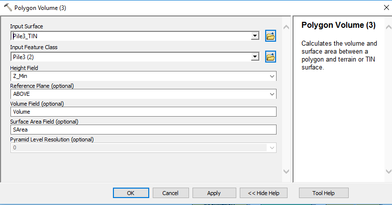
The first step is to convert the rasters created after the mask to TIN files using the Raster to TIN tool. The next step is to use the add surface information tool to add the z_mean and z_min field to the Tin files of each of the piles due to the TIN creation not carrying any information during the Raster to TIN tool (Figure 10) (Figure 11).  Finally, The polygon volume tool is used to input the volume into the original feature classes created the parameters can be seen in (Figure 12). Also in (Figure 13) there is a whole model builder showing the pathways created for this information to be created. 
Figure 10: Raster to TIN tool.
Figure 11: Surface information Tool. 
Figure 12: Polygon Volume Tool 

Results

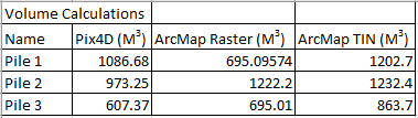
This is the table displaying the information calculated in the Pix4D, Raster, and TIN Volume calculations. 


Discussion

The numbers generated in the volume calculations are all variant of each other and are not going to be 100% accurate.  The polygons that were used between Arcmap and Pix4D are not going to be the same due to having to be draw two different times making this a point of inaccuracy.  A way to fix this would be to possibly take a screen shot from Pix4D and georeference the image to Arcmap to create as close as accurate boundaries as possible, but there is still a difference between the raster and TIN which uses the same feature classes and still comes up with different numbers.  For example, Pile 1 went from 695 to 1202.7 in the raster to TIN, and comparing this to the Pix4D value of 1086 it does not make sense for the raster version to come out at such a low value of 695.  

The easiest of the three to do this was the Pix4D version due to just having to create polygons around the piles to calculate a volume which is perfect for getting an estimate quickly. The raster also seemed to be easy, and could even become more accurate if going out in the field with a gps to get the exact boundary of the pile.  The TIN version well also relatively easy did not seem to create an accurate number because of the way the triangles align which may mess with the elevation levels.  Therefore, there may not be a perfect way for doing this making these three way each capable in their own way.  


Monday, March 27, 2017

Processing Multi-Spectral Imagery

Introduction

This weeks lab includes working with imagery that contains five bands which are blue, green, red, red edge, and infrared.  The difference between working with a red edge sensor and a regular RGB is that it can collect light waves that are between the red and infrared sensor.  It also then creates separate images for each of the different bands instead of making one image containing RGB which then have to be separated if needed.

Methods

The first step is to open up Pix4D, which can be used to process the images taken by the platform.  This is done by choosing the Ag-Multispectral Processing Template (Figure 1), but when choosing this template in the processing options the orthomosaic option needs to be checked so it is made to later be used in ESRI's program.

Figure 1: When starting the new project select Ag Multispectral. Obtained from  Pix4D Support Website.

Next, after Pix4D is finished processing the images, open ArcGIS Pro or ArcMap and in the search bar type in composite band.  This allows the user to combine the bands to create a composite.  The bands need to be entered in the order: blue, green, red, red edge, and IR (Figure 2). Once this is finished a composite will be generated which will allow the user to start on the end goal of creating a impermeable vs permeable map for this specific lab.


Figure 2: This is the Composite Bands tool which allows the user to combine all five bands into a single raster image.  This needs to be in the correct order otherwise later processes will not work correctly. 

After, generating the composite image the next step is to run the segment mean shift tool (Figure 3) This smooths out the image to allow for easier classification in later steps.  For this the spectral detail was changed to 8 and 2 for the parameters.  This should take a few minutes, but depends on the size of the image.

Figure 3: This is the segment mean shift tool.  This allows the user to create a more general looking image to create classes from.  

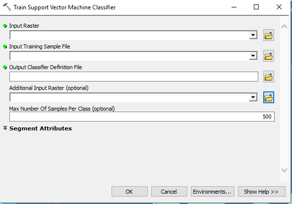
Next, is to go into the toolbars and find the image classification bar.  Then combine the same classes of road, driveway, roof, shadow, field, grass, farm area (Figure 4).  Then once finish save the file to be used in the next tool.  The next tool is the train the train support vector machine classifier.  This allows the program to sort the pixels into different classes based on the image classification file.

Figure 4: This tool creates samples to use to train the classifier in the next step.  It is important to make separate classes to make the different layers. 


Once the tool from the previous step is finished the next step is to reclassify.  To do this use the reclassify tool and change the classes that are impermeable to 0 and the classes that are permeable to 1.  This allows the user to create a simple map that shows what area are permeable.

Figure 5: This tool allows the raster to be classified into the categories created in Figure 4.  This will create a new image that can be then reclassified into a final map. 
Results


Figure 6: An RGB map of the Study Area.
Figure 7: A false Color IR of the study area.
Figure 8: A Red Edge image of the study area.

Figure 9: NDVI of the study area showing crop health.
Figure 10: Permeable vs Impermeable layers.  Not well created from the training sample vector machine.

Discussion

This lab seemed to be one of the more nit-picky labs in terms of file management and making sure everything was saved in the correct place to be used. It also was helpful to look back at the previous lab and even bring in the same tools. The map created for the impermeable vs permeable area was not easily created and does not even come close to perfectly showing what it should be.  The shadow of the house was included in the house instead of the vegetation, and there are random areas in the upper right that are classified as house instead of vegetation.  There is also not a neat line that goes along the road and instead gives a more of a fuzzy look.  It also did not classify the house as even being impermeable, and rather put around the house as the impermeable area (Figure 10). This would not indicate the best way for determine the permeable vs impermeable layers.  Using the classifying tool does not give the highest accuracy and should be used with caution. In Figure 9 there is a NDVI showing the plant health.  This is an interesting figure because it shows around the house that there is very healthy green grass that can be seen in Figure 6.  It also shows farther away from the house where the land is less likely to be cared for in the same fashion as the grass near the house, shows that the quality is diminished for plant health.  With this type of sensor there area many different types of application.  It can look at agriculture health to determine what areas need to be watered, and by using the rededge sensor the user can select which bands to look like without having to extract them because they are already extracted.

Conclusion

UAS can be a tool by using a rededge sensor for agriculture use.  If someone was taught how to use a UAS the user could potentially every day use the UAS to figure out which fields need to be watered compared to the ones that do not.  This can save water and time spent on watering fields that are not needing it as much.  With the red edge senor having five separated bands it creates more uses that can be looked at with different types of images and not just RGB.  It can look at RedEdge, IR, or False color IR. For rededge the most applied use will be within agriculture.


Sunday, March 12, 2017

Pix4D Processing with Ground Control Points

Introduction

This lab was meant to bring understanding to why there is a need to have ground control points when taking aerial photos with a platform.  The ground control points (GCP) add an extra level of accuracy to the final project than without them.  For this lab the same data was used as the last Pix4D lab except GCP were added into the equation to create a higher quality dataset.

Methods

The first step is to open up a new project in Pix4D and create a folder to save everything for the project in with a decent naming scheme to help organize the information.  Next, add the images like the previous Pix4D lab.  Make sure the camera is on linear rolling shutter before starting the initial processing. After the initial processing is over, go to Project ---> GCP/MTP Manager.  This open up a screen that will allow the user to upload the GCP file (Figure 1). For this GCP file the order needd to be switched to Y, X, Z due to where the Y value was placed in the .txt file.  This should be double checked before going on to save time later after secondary processing has taken place.
Figure 1: Showing what the imputed GCP will look like. 
Next, there is a problem that starts to happen.  The GCP are not tied to the ground well making the pictures and GCP appear that they are floating.  This is not the easiest problem to fix, but it can be fixed using the basic editor or the rayCloud Editor found at the bottom of the GCP manage.  

Now, to tie down the photos, the user needs to go through 3-4 of the points to correct the ground control points (Figure 2).  For the rayCloud editor, go through each GCP and for the first few images fix the location of the point.  Once that is completed selected automatic marking and then apply.  Continue this for each GCP.  Finally, once accomplished rematch and optimize the dataset (Figure 3).  
Figure 2: Ground control points being fixed by the ray cloud editor. 

Figure 3: Showing where the rematch and optimize tool is. 
Next. after the rematch and optimize the 2nd and 3rd steps need to be done on the processing.  This is going to take little while, therefore it is good to plan some other work to be done at this time due to the time needed to process.  Once it is done it will have connected the GCPs to the ground along with the images (Figure 4).  

Figure 4:  This image shows the ground control points and images connected to the actual level of the ground.  
Now, there are two ways to deal with having two sets of data for this project.  First of all, with only two sets it can be done with both of them at the same time for processing, but if there are more data sets than 3 or 4 then a merge needs to be done to allow faster processing times or just as the project is completed over multiple days can still be added to the first project.  This is done on the first screen by selecting the merge project instead of new project.  Finally, once the Orthomosaic is finished it can be opened in ArcMap where it can be made into a cartography pleasing map (Figure 5).  


Results

After all the processing is finished the newly created DSM can be brought into ArcMap where a finished project can be created for the viewer to see the data.  This map has turned out slightly more accurate than the map created in the first Pix4D lab which is a result of using the ground control points.  There is more detail made along most of the sand piles in the located in the right center of the map.  The area with the most distortion also has been limited to the area instead of having long dragging areas its more of just lobes on the bottom.  This only would have been fixed competently if there would have been more images taken in this area.  The elevation is also at its lowest point near the water which makes logical sense.  


Figure 5: A Map created from Pix4D using Litchfield Flight 1 and 2 Data. 
Conclusion

Ground control points are a great tool to have more accuracy on the finished project than without having any GCPs at all.  There are also needed when merging two different projects from the same location together to generate a more cohesive map.  Also, having fieldnotes with location of the GCPs drawn out and also having a list on the computer of each of their location would be a great idea for a back up plan if for some reason all of the data was lost or corrupted.  

Sunday, March 5, 2017

ArcGIS Pro Demo

Intro

Today will be a dive into ArcGIS Pro demo which can be located at here.  This demo is to teach how to create a permeable/impermeable layer map from an aerial photograph.  This is done by using a few different tools that will be mentioned in the methods section.  ArcGIS pro is the new updated version of Arcmap and ArcScene.  In a few years ESRI will be moving to ArcPro.  The main difference is having more of a ribbon style banner instead of the tool bars everywhere.

Methods

The first step is to open up an already processed aerial image into Arcgis Pro.  This one used for this demo had a resolution of 6 inches and contains 3 bands.  Under the projects tab and then under task there is a calculate surface imperiousness tool.  This is used in conjunction with the bands to determine where there is surface imperiousness (Figure 1). Then the next tool used is called "group similar pixels into segments." This allows the image to be simplified to more accurately classify broad land-use types (Figure 2).

Figure 1: On the right, where it is highlight is under the tasks, and on the left is what the tasks open up into.  This allows the run of the surface imperiousness tool.  
Figure 2:  This is the more simplified image which shows the smooth edges well.  
The Second lesson has the user open Arcmap to create a training sample, which cannot be made in ArcGIS Pro currently.  therefore, a shapefile will be made to open in ArcGIS Pro.  First, open the Neigborhood and segmented images and turn on the image classification toolbar.  To use the image classification tool bar spatial analysis needs to be turned on in the extension window.  Next, on the classification tool bar click the drop down on the draw polygon tool to select the draw rectangle tool. Next, start to draw rectangles on the roofs of the houses found in the cul-du-sac.  Then open up the training sample manager (Figure 3). Next, highlight all of the training ID's and merge them together into one class name.  The next step is to repeat the last step except for roads, driveways, bare earth, grass, water, and shadows (Figure 4).   Finally, to finish this step open it back up into ArcGIS Pro.
Figure 3: Image showing the rectangles on the roofs, and where the class can be found in the training sample manager. 

Figure 4:  This is an image showing the Training sample manager should end up like.


Now, back in ArcGIS Pro open up the train the classifier task.  This opens up the parameters window.  Input the raster and training sample file, and then make sure to save it in the correct place with the extension .ecd (Figure 5).


Figure 5: Train the classifier parameters window.  

The next step is to select the classify the imagery from the tasks tool bar.  Input the correct information into the right spots, and run the tool.  It should create an image that has the colors of the classes to look like Figure 6.
Figure 6: Reclassified image of the original using the classes created from the pixel color.  
Now,  it is now on the reclassify tool which allows the user to change the value of the fields.  For this demo change the gray roofs, driveways, and roads to 0, and change the rest of the fields to 1.  This will create an image like Figure 7 after it has ran the reclassify again.

Figure 7: the final reclassify that distinguishes between roofs, driveways, and roads to bare ground/penetrable ground. 
Finally the last lesson is to calculate impervious surface area.  To start, click on the create accuracy assessment points in the task window.  Then enter the information as described in the tutorial and let it run.  It will create an image that looks like Figure 8 with all of the accuracy points now added into it.
Figure 8:  Accuracy points added to the map.  
The next step is to open the accuracy points in the contents window to allow the modification of the GrdnTruth column.  The 1 means permeable and the 0 means impermeable.  This is required to go through each point to determine this and change as needed (Figure 9).  Then return to the task bar and hit next and run to finish the accuracy assessment points.

Figure 9:  Showing the editing of the GrndTruth. 
The next step is to compute a confusion matrix.  This is done by selecting the compute a confusion matrix under the task window.  Then enter the accuracy points in the input and create a correct output. This generates the ability to give an estimate on how accurate the data is.  In Figure 10, the image is showing an accuracy of 92% under the Kappa heading.
Figure 10: Showing the Confusion Matrix Results. 
Next,  is to fill out the tabulate area parameters with the information found in Figure 11.
Figure 11: Tabulate the area parameters. 
Now, after creating the new table a table join tool opens up next that can filled out exactly like Figure 12.  This joins together the two tables.
Figure 12: Table join.  
Finally the last step up sets is to symbolize the parcels.  The first step is to select the clean up the table and symbolize the data from the tasks window.  This is done by deleting a field and modifying the name of a few of the fields to better suit their needs (Figure 13).
Figure 13: Attribute table being edited. 
Finally after modifying the attribute table go to the symbology window to change it to graduated colors maps with 7 breaks (Figure 14).
Figure 14: Graduated color map showing the impermeability of the land classification with 7 different classes. 
There are a few different patters that can be seen in the image above.  First off, There seems to b a lot more of the yellow (permeable) on the outside of the neighborhood compared to the middle which is due to the houses surrounding the pond.  Therefore, most of the water filling the pond may be coming from the outside of the neighborhood instead of the neighborhood where it most likely just flows off. Also, the pond itself is not the darkest red (impermeable) due to its ability to take water into the ground.  

This data set can be used with UAS by doing a comparison to data collected by UAS using the same type of imagery, and looking for similar spectral patterns.  A UAS platform may even be able to get a more accurate representation of the area by generating a larger amount of pixels.  This type of map can be used as a first look at the data, but a UAS should be able to get more detail if needed.  Also, a UAS would be able to make this faster if using the same method.